The Problem Set
Recent studies have revealed that young people are feeling more lonely than ever. I wanted to build an app that motivated people to spend more time out in the world finding community. Thorough research into the concept of third-places and institutions uniquely suited to the benefits of augmented reality (AR) led me to identify the museum industry as a high potential market for disruption.
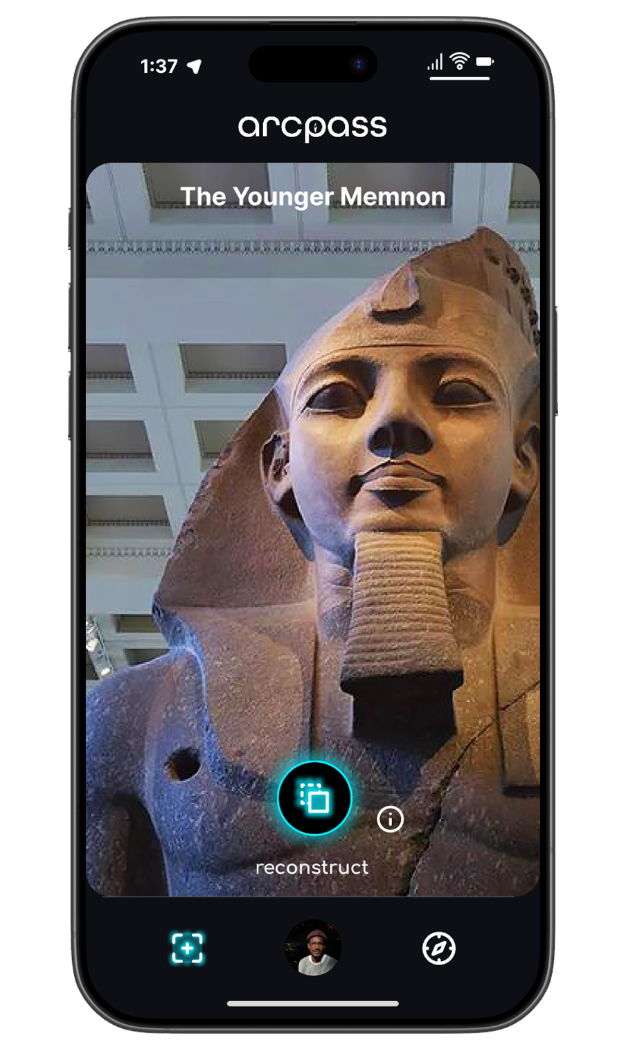
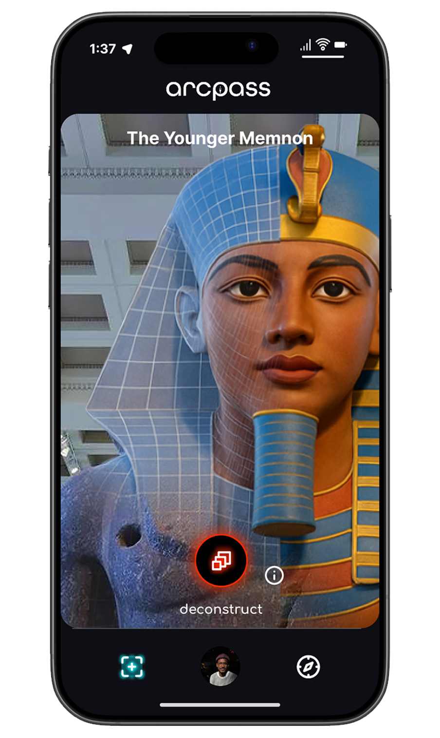
Through leveraging AR technologies there is a potential to transport users back to any point in history, reconstructing historical objects and scenes to match what they would have actually looked like years ago.
The Users
Although I knew I wanted to target younger people, I knew it would take more research to discover who exactly the early adopters would be. I worked with a fellow researcher to develop two surveys that would help narrow down not only who would use Arcpass, but how they would use it. We received over 160 responses in total that informed the two user personas below.
Peter
26-40 | History Buff
I find the prospect of traveling back in time to see what the world would've been like back then to be so cool! Being able to interact with history like that makes it feel all the more real.
Kara & Michelle
18-25 | Social Travelers
As frequent travelers, we like to explore new places and find new friends with Arcpass. Having shared AR experiences makes connecting with people and places fun and easy!
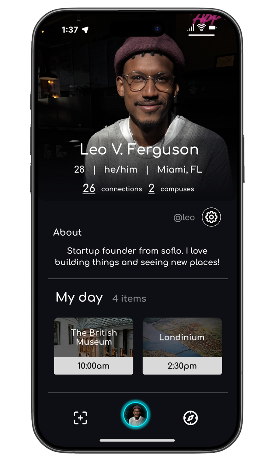
The Profile
In support of confronting the loneliness epidemic, having the ability to connect with others is a feature that I feel strongly about including in the app.
When designing the profile, my intention was to design an interface that could provide a foundation for these social connections without sacrificing on practical functionality. In this design, users can seamlessly re-visit past connections while providing information that can foster new ones. With an easily accessible ability to plan and organize their next adventure.
The Camera
Maintaining a sense of continuity across AR interactions was an important factor in establishing a brand identity for Arcpass. Having a UI that remained familiar no matter the experience or user objective was essential.
For this I leveraged minimal on-screen elements that deliver on functionality while keeping the experience the center of focus. With contrasting colors and iconography guiding the user to different actions, often with the light teal Arcpass accent color.
An approach like this will lower the learning curve for new users.
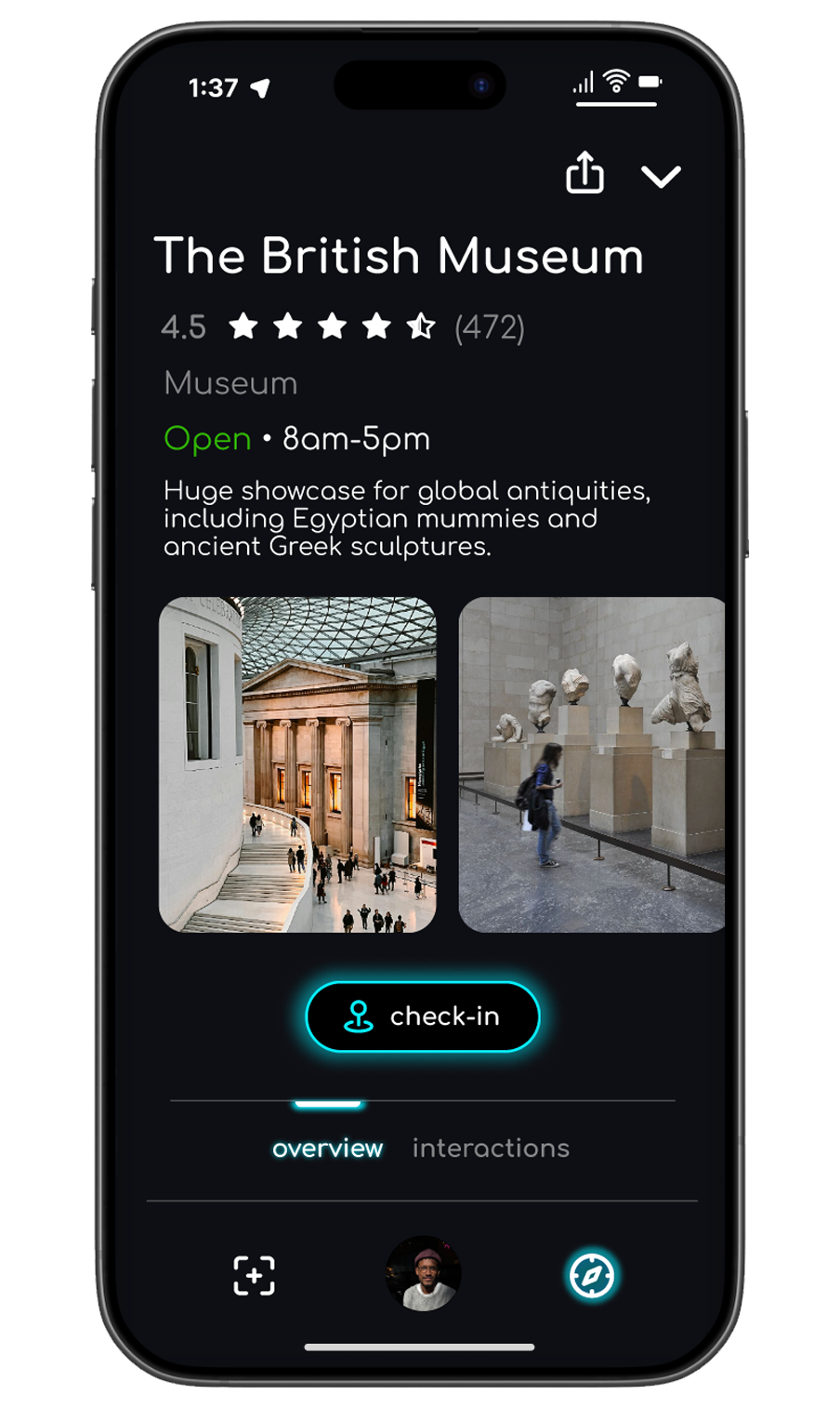
The Campus
The “campus” is a partnered museum that hosts unique AR interactions on Arcpass. By checking-in to a campus, Arcpass users gain role-based access to AR interactions in and around the building. Generating records of how they interact with the premises as they go along.
This dynamic unlocks a new way of interacting with physical spaces and learning about the users who visit them.
The Logo
I designed the Arcpass logo to be representative of a tool that people use to find their way to new places and new friends. As the name Arcpass is a play on the word "compass", the dial centered in the middle of the text is meant to symbolize this idea, with the smooth minimal font also accentuating how simple and straight forward Arcpass is to use.
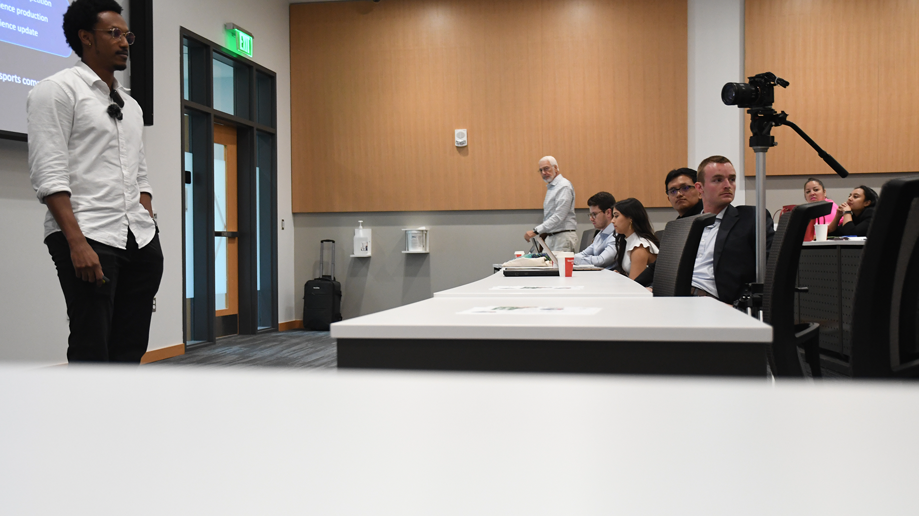
The Outcome
My work in designing Arcpass led to the project being accepted into the 2023 cohort of Miami Hack Week and the finals of the 2023 FAU Business Pitch Competition! Solidifying the public's interest in the concept.
other projects